As fresh as new fallen snow…well not exactly, and far less exciting. But we are pleased to present the completely rebuilt and redesigned FasterSkier website.
We wanted to highlight some new features, give an idea of the next step, and request assistance as we work out the kinks over the next few weeks.
The primary motivation behind the new FasterSkier site was to improve performance and stability, while taking advantage of new technology and larger screens. From a nuts and bolts standpoint, we have accomplished just that. The site should run faster, handle high traffic loads better, and allows us to present information more efficiently.
So what’s new from the user perspective?
— Article blocks. There is only one example currently on the FS homepage, but we will be using more over the next weeks. Article blocks allow us to group articles from the same event together. We have received feedback on the quantity of content we produce during the racing season. I will not be convinced that we should write fewer articles — that means not covering important races, ignoring certain athletes, etc. We don’t expect everyone who comes to the site to read every article (please do though!).
But during busy weekends, the volume often meant that many articles quickly were pushed down the main page. The article blocks will help with this. One article is featured, with a summary and photo, while the associated articles are just linked titles.
— Classifieds. We have had numerous requests for classifieds. Now we have them. They are free. List your stuff.
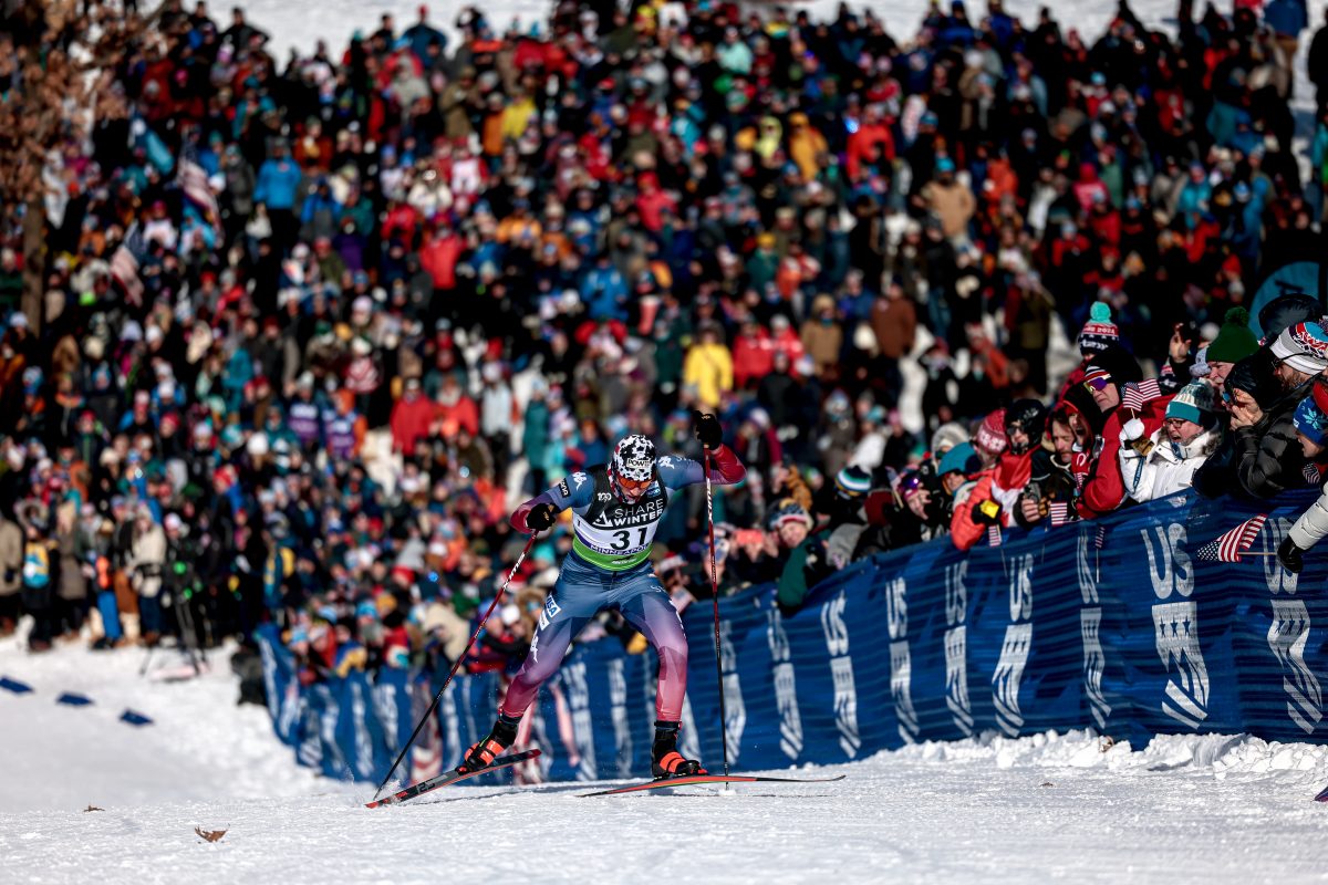
— Featured photo. It is sad to see the old FasterSkier banner go, but the aspect ratio was brutal and limiting. We can now display a very large, and relatively square photo behind the site. Click the little camera icon in the top bar to hide the content and see the whole photo. Coming soon — information in the top bar on the content of the photo.
— Separate sponsor news. In the past there has been some confusion as to what is original FasterSkier content, and what is a press release from a sponsor. Additionally, sponsor press releases would often be quickly pushed down in the main column. There is now a new box in the right column with info from our sponsors. This way we can better feature our sponsors, while maintaing a clear division between the editorial side of the site and advertising side. It is definitely worth keeping an eye on this box as many of our sponsors produce interesting and useful articles.
— There are many other small improvements that hopefully will make reading FasterSkier a better experience.
What’s next?
We are hardly done. Here are a few things to look forward to.
— Blogs. The FasterSkier blogs are also being completely redesigned and integrated into the new site. One user account will allow you to comment on blogs, the main site, post in the forums and list classifieds. The new blogs are almost ready and will be launched soon.
— Calendar. FasterSkier used to have a race calendar. We will have one again.
— Fixes. Overall the new site is functioning at a very high level. But there are plenty of small issues. We are aware of many and are working to get them fixed as quickly as possible. We appreciate your patience and are grateful to readers who have reported problems to us. If you come across something that doesn’t seem to be working, please let us know!
As always, feedback is appreciated. Let us know what you think, what we did a great job on, what could be better, and any new features you would like to see.


4 comments
skiwax
November 29, 2012 at 12:40 am
Thanks for the updated site. It looks great!! For a while will take a bit longer for people like me to find what I things that have moved, but that’s to be expected. You continue to set the bar for up-to-date skiing information.
caryharding3
November 29, 2012 at 5:16 pm
Looks terrific!
highstream
November 29, 2012 at 5:21 pm
Like the general idea. Brings it alive. But for me, it feels much too “busy,” especially up top where one first looks. There was clear demarcation between the columns before that is lost now and is not recovered with sufficient differences and space. The outer columns are offset a little, but they seem too wide or maybe it’s the typeface/font size that don’t work well enough. Just too crowded to my eyes, even after a couple of days.
highstream
November 29, 2012 at 5:32 pm
Another observation: is it my bad recollection or are the number of center column articles one can see on first view now reduced? That top page view is awfully important for presenting what is still current, and for allowing readers to see quickly articles they missed or put aside, or ones with discussions they want to follow. The life of articles dropped from top page view diminishes rapidly.