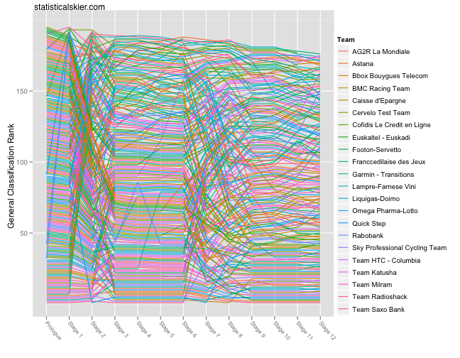
Commenter ryank asks if I can color code the lines for each rider according to their team. I can, but it doesn’t lead to a great looking plot. The reason is that there are just way too many teams and distinguishing that many colors just isn’t pleasant.
But I’m nothing if not responsive to my reader(s), so here it is:
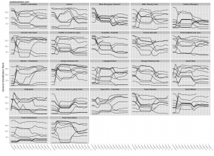
 Like I said, not so hot. There are 22 teams, which is way too many to distinguish by color. A better option is faceting (or trellising):
Click through the image for a larger version. I’ll leave it to the more educated cycling commentariat to interpret this plot, since there’s a lot going on in this one.


