(Updated with results from today’s stage.) A few years ago I saw that someone had made some bump charts based on Tour de France results. (I actually was alerted to them via Junk Charts). Brilliant! Sadly, it hasn’t seemed to catch on, as I haven’t seen these sort of graphs floating around much since then. Then again, maybe they’ve been everywhere and I just missed them. In any case…
Statistical Skier to the rescue! Sure, it’s not skiing related, but let’s be honest. The proportion of cross country ski racers paying fairly close attention to the Tour is probably pretty high. Graphs below the fold…
All my data comes from Cyclingnews.com. The original versions of these plots just looked at the general classification rank of each rider. We can expand on that some, but for starters let’s stick to the basics:
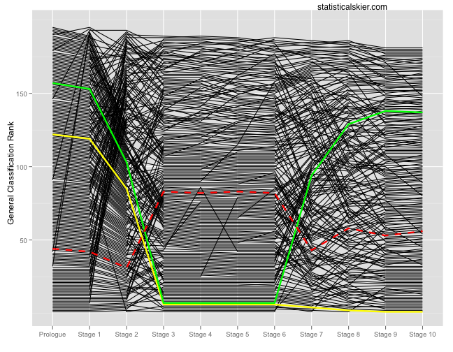
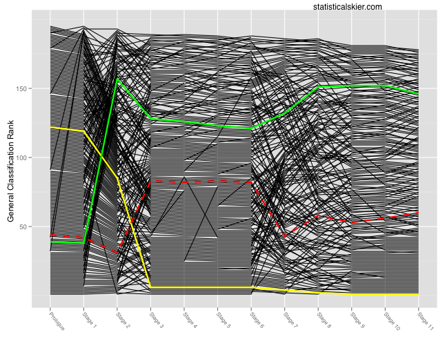
If you’re not familiar with bike racing, the colored lines might be confusing. The yellow line is the current overall race leader (Yellow jersey, currently Andy Schleck). The green line refers to the overall sprint points classification leader (Green jersey, currently Thor Hushovd) and the red dotted line refers to the mountain points classification leader (polka-dot jersey), currently Jeacuterocircme Pineau. No, wait, that’s Jerome Pineau. My screen scraper was a truly quick and dirty affair so I neglected some simple things like, say, character set encodings. Ah well. <1
The x axis refers to the general classification rank after that stage. So the chart begins with the general classification rank following the prologue. I’ve improved slightly on the original by having riders who’ve dropped out of the race simply have their line end, rather than shoot up off the graph. On the other hand, I’m not particularly happy with all the black lines. I might have to play with the colors a bit…
I’ll update these graphs periodically (hell, maybe daily) during the tour. Also, we can experiment with plotting things other than the general classification rank on the y axis. Although if you have suggestions, keep in mind that all the data I’m scraping are the GC, points, mountain and team classifications from the results pages as cyclingnews.com. So that’s all the data I’ve got. But that includes times and teams, which is enough to play around a little with some different stuff.
Update: I wrote this while stage 11 was taking place. Here’s the same graph with up to date results:
- As a side note, screw you Cofidis, for putting a comma in your team name! You can go to hell! <↩


