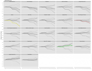
Inspired by the slightly different charts found here, a chart of a different flavor today. At that link, Martin has wisely adjusted plots of time back for each stage by the median. I’ve taken that idea and plotted the time back in the GC category for each stage, but I’ve split it up by team and ordered the teams by the current team classification. Finally, I’ve added a black line that represents the mean, or average, time back for each team. Graph is below the fold…
Obviously, that’s a big one, so you’ll have to click through for the full version. As always, the yellow line is the current yellow jersey holder, green is the points leader and the red dotted line is the mountains classification leader.
The average time back represented by the black lines will not necessarily match the team classification ordering, since I believe that only counts the top few riders from each team.
Also, in case the centering has you confused, zero represents the median time behind the GC leader at each stage, which we’re defining to be the peloton. Lines trending down are moving away from the peloton and vice versa.
Related posts:
- <Tour de France Bump Charts (Updated)
- <Tour de France Bump Plot: Stage 12
- <Tour de France Bumps Chart: Stage 14


