With the final stage complete, it’s time to wrap things up with some final versions of the charts I’ve been making over the past week. Actually, this isn’t really the final post. I’ll be tinkering with some of them and posting what I come up with from time to time. Also, the fancier, SVG (scalable vector graphics) versions with mouse-over text and animations won’t be updated in this post. Look for those later in the week. Also, if there’s something you’re dying to see, mention it in the comments and I’ll try to oblige if I can.
First up, the GC chart:
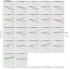
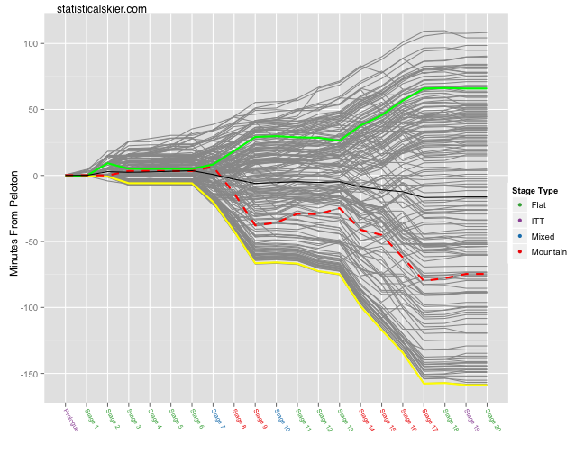 You’ll notice that I’ve switched from plotting GC rank to plotting the minutes from the peloton (defined as the median rider after each stage). The darker black line is the average for all riders. And of course, I’ve labelled the stages so you can tell which ones were mountain, flat etc. Here’s the same plot but broken down by team (click through for full version):
Next up, average speed by stage:
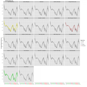
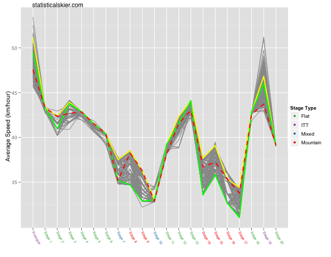 And again the same plot broken down by team (click through for full version):
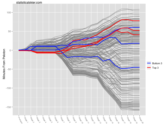
And finally, a look at how the top and bottom three riders from the Prologue faired for the rest of the tour:
 As I’ve mentioned before, this was kind of fun, even though this site is supposed to cover skiing. So I’m going to continue making these kinds of charts for the grand tours (TdF, Giro and Vuelta) as best as I can. I have some ready to go for this year’s Giro so stay tuned…
Related posts:
- <Tour de France Bump Charts (Updated)
- <Tour de France Bump Plot: Stage 12
- <Tour de France Bumps Chart: Stage 14

