The connection is pretty obvious, actually. Both are mass start races that involve switching activities at least once during the race. The change in activities is certainly more extreme in triathlon, but you get my drift.
Some people (like, say, me) complain on occasion that pursuit races in cross-country skiing place too great an emphasis on the skating portion. The order of techniques has settled into always doing classic first and then skating for practical reasons (having the classic skis waxed properly and delivered at the right time would be hectic, to say the least). But the result has been races that plod<1 along during the classic half and then finally people start to accelerate during the later stages of the skating portion.
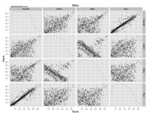
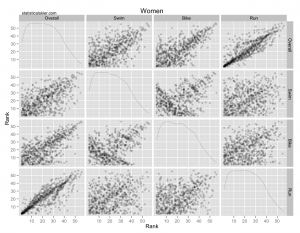
The triathlon data I ran into recently happened to give a very stark picture of what happens to the relative importance of each activity in these types of races. While noodling around with the data, I plotted scatterplot matrices of the ranks for each stage of the triathlon for men and women (click through for larger versions):

 All I’ve done here is to extract the ranks for each portion of each triathlon (Swim, Bike, Run) and the final overall rank and plotted each one against each other. So while each plot has 16 panels, you’ll notice that half of them are just reflections of another one.
For the moment look at just the top row of each graph, which shows the rank of the Swim, Bike and Run portions versus the overall rank that you end up in the entire race. It’s very clear what’s happening. The run is extremely highly correlated with your overall place, while the bike is less so and the swim even less so. Being the fastest swimmer or biker isn’t very important. Being the fastest runner is extremely important. For the men, in fact, the lack of correlation in the swim and bike portions is astounding; the point cloud is almost perfectly rectangular!
I think this type of thing will happen anytime you have a mass start race that changes activities part way through, although there are some other factors at play in the particular example of triathlons. There’s probably some psychological stuff going on that would be interesting to investigate I suppose. Obviously, the nature of swimming (and the length of the swim) will make it inherently difficult to “break away”, while the fact that drafting is permitted during the bike makes it downright foolish to try something during the bike, I’d imagine.
I wish split time data were easier to scrape from WC results, since then I could make similar plots for the XC pursuits. Other than playing with the order (classic first, then skating) I suppose FIS could try adding time bonuses for the classic portion of the pursuit. It would be tough to implement, though, since you couldn’t just base it on what place you are in after the classic portion. You’d have to use the actual time gaps of the top 3 skiers, say, over the 4th skier, and award time bonuses equal to the gaps. Even that wouldn’t work well.
Ah, but how about the really crazy looking panels in these graphs? You know, the Bike vs. Swim panels! Apparently there are a small number of racers who are good at both, and a slightly larger group that are bad at both. But for the overwhelming majority, how well you do in the swim in inversely related to how well you do in the bike! Are these people who are actually trying to break away during the swim and blowing up? I kind of doubt that. In any case, those scatterplots were just too wacky looking not to share…
- No offense intended, obviously. I probably couldn’t keep up with the “leisurely” pace of the classic portion. <↩
Related posts:
- <How I Learned to Start Worrying and Hate the F-Factor (Part 1)
- <Bjoern Daehlie vs Thomas Alsgaard
- <More Tour de France Data Visualizations

