Several people have commented that my summary graphs should take into account skier’s potentially differing abilities in skating and classic. (We could slice up the data as thinly as we’d like: mass start vs. interval, etc. But that will get complicated quickly, so let’s add technique and see how it goes for now.)
I pondered this a bit and made a few decisions:
- The reason my graphs in the follow up posts were a bit misleading in a few places (Majdic, Longa, Bauer) was because I didn’t have a way to visualize technique differences in the first place, in the race snapshot graphs.
- The best way to incorporate more information in the race snapshot graphs would be to leave my comfort zone (R graphics using lattice or ggplot) and hand code them to be partially interactive using some more “traditional” web technologies: PHP, Javascript, HTML5, etc.
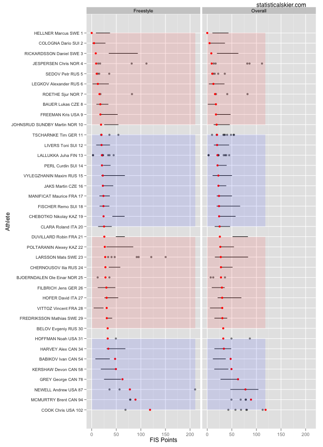
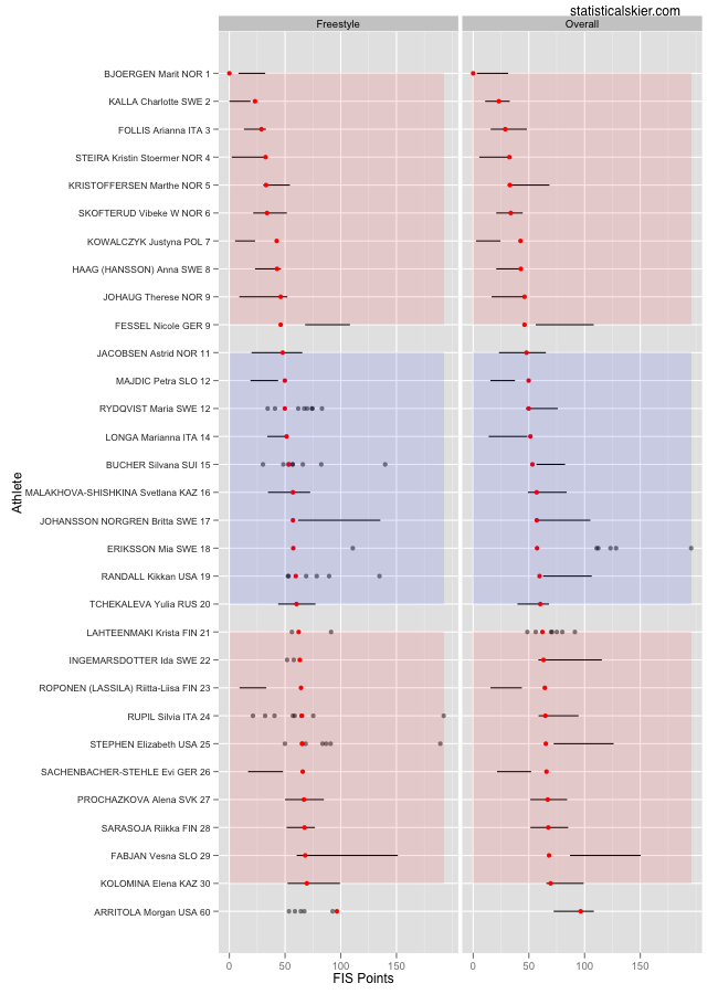
(2) is a goal of mine for this site in general, but that’s going to be an “off-season” project, I think. So I’m going to go with a decent, but probably sub-optimal solution for now. What I’m going to do is just make duplicate graphs and place them in side-by-side panels for the race snapshots. That means your eyes have to do a bunch of darting back and forth, which isn’t great. But I think I’ve optimized the “best solution + easy for me” cost function here.
Here are the new versions (reduced, top 30 plus North Americans only):

 As it turns out, I think that Majdic and Longa’s races, in terms of their freestyle ability, are still on the “bad” end of the spectrum, but less so. I was more misled in the case of Lukas Bauer, who is exhibiting a starker shift between his freestyle and classic skiing. (I’m not saying Majdic/Longa don’t have a preference for skating; Majdic’s is pretty strong. But it just turns out that, in terms of FIS points, that wasn’t a great skate race for her after all.)
I’m not going to go back and redo all the more detailed graphs this time, but hopefully these summary graphs will sharpen my analysis a bit going forward.
PS – Yes, I know the alternating color blocks are truncated in the horizontal direction in the men’s graph. I think there’s a simple solution for that. If we really want to get picky (and I am!) I’m still bothered that in the reduced versions the skiers outside the top 30 are included in the block coloring as if they were really in 31st, 32nd, etc. Baby steps…
Related posts:

