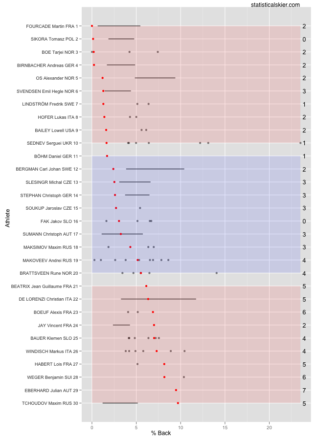
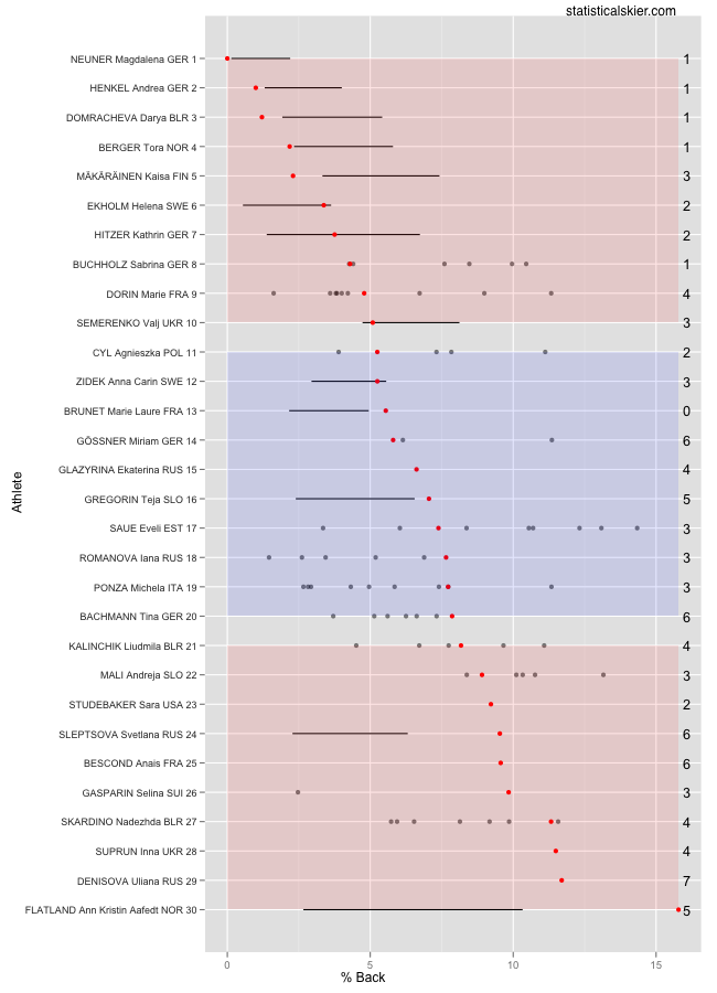
These graphs will look the same, but I tried something a bit different for these. Mass start races in biathlon are similar to those in cross country in that they tend to lead to tighter races and hence lower percent back values than in other race formats. So I’m trying out restricting these versions to only other mass start races. So the black bars represent the middle 50% of that skier’s previous mass start results, rather than all their results. That means many more athletes than usual have very few races to compare to, but the comparisons we can make are a bit more fair.
I’ll work on a better solution to this, though.
Oh, and nice job Lowell Bailey!
Related posts:
- <Race Snapshot: TdS Classic Mass Start
- <Race Snapshot: IBU WC 4 Mass Start
- <Race Snapshot: IBU WC 6 Men’s Mass Start


