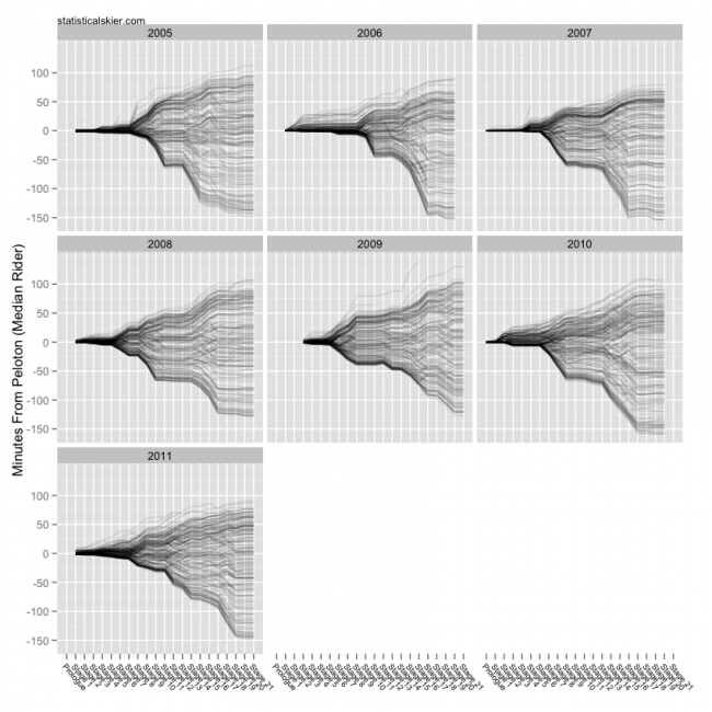
The final installment of the 2011 Tour de France graphs, and what a fun race that was this year! Plenty of excitement (for some not so fun reasons) early on and then plenty of exciting racing towards the end. Good stuff…
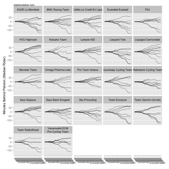
 As usual, you can click on them for slightly larger versions. Here’s the same graph for 2011 broken down by team:
 Oof. The x axis is a little scrunched there, sorry ’bout that.
Finally, there was a lot of talk early on in this Tour about how many riders we were losing. Here’s a look at the stage by stage attrition of the past seven Tours, but keep in mind that this makes no distinction between the reasons that a rider fails to make it to Paris!
 This year’s Tour is in blue. Interestingly, while the 2011 Tour saw a lot of attrition early on compared to other years, by the end it was actually not as brutal as several others.
Related posts:

