If you hang around skiing in North America long enough you will eventually hear people talking about point differences between races in Europe and North America (or the US in particular). One of the most common forms of this is the complaint that penalties (and hence points) are artificially high in the US, compared to Europe.
While I’m certainly sympathetic to criticisms of the vagaries of FIS points, I’ve always felt this complain was a bit short on data. It’s certainly plausible that race penalties are systematically lower in Europe, but that doesn’t necessarily mean that the differences are in some sense “wrong”.
The most direct way I know of to examine these sorts of issues is to isolate individual skiers who raced in North America and in Europe in a given season, and compare their points. If the North American races are seeing artificially high point levels, you would expect the average skier’s points to be systematically higher in North America than in Europe. (If FIS points worked perfectly, they’d be roughly the same.)
Doing this raises some sticky questions of which racers and which races to include. Since this is most often raised among North American non-World Cup level skiers, I think it’s most instructive to restrict ourselves to just that category of skier. So we’re only going to compare points from non-World Cup level events.
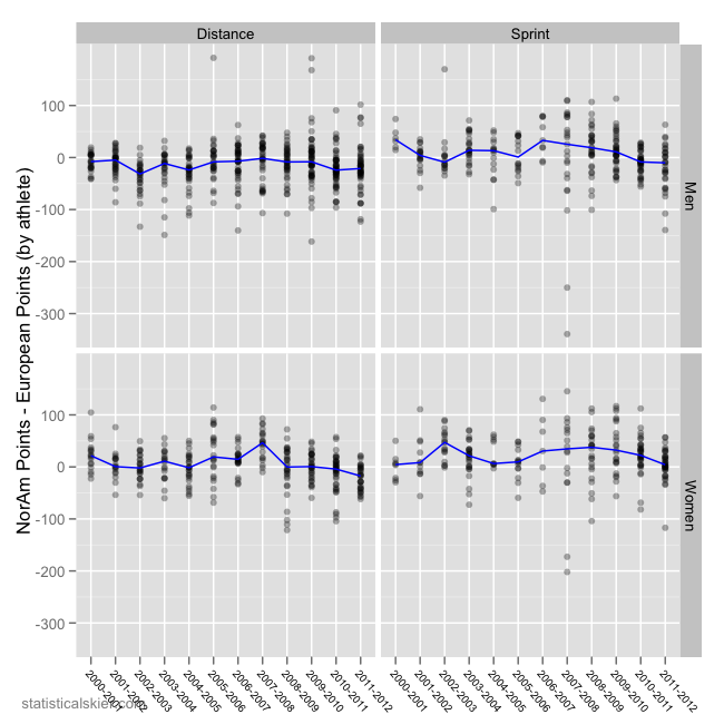
Here’s our first graph:
Each dot represents a single skier. Specifically, the difference between the median FIS points for North American races minus the median FIS points for European races. (Obviously, only skiers who competed on both continents are considered.) Clearly, this shows that there is a lot of variation from skier to skier, as we would expect. Someone might be killing in the US, travel to Europe and get sick and race very poorly, or vice-versa.
But it’s the blue trend lines that we’re really interested in here, since they are what will measure systematic trends. Given the scale of these plots, it’s a bit of a challenge to interpret. So let’s redraw just those four lines on a common scale:
Remember, the y-axis is North American points minus European points. If North American races systematically have higher points, we would expect these trend lines to be solidly above zero. And some of them are! Or at least, they have been in the past.
The line that stands out as the most different here is the men’s distance line. For a while it flirted with approaching zero in the mid-00′s, but has spent most of its time at around -20 FIS points. This means that US/CAN men, on average, get FIS points that are around 20 points lower in North American than in Europe. This is the exact opposite of what we’d expect if North American races had artificially high FIS points.
The other three lines have generally been above zero, sometimes by quite a lot, sometimes just barely. But all three have dropped dramatically over the last 3-4 seasons. This past season, the only one still above zero is women’s sprinting.
The other thing to note here is that FIS points for sprinting only captures qualification speed, nothing more. Any differences in competitiveness in the heats would not be captured here.
Related posts:
- <North American Race Penalties Over Time
- <Predicting FIS Points For World Cup Races
- <Predicting World Cup FIS Points (con’t)


