In a short piece on FasterSkier the other day, I showed a graph that examined the FIS points vs. age trends of skiers broken down by their success at WJCs or U23s. In it, I highlighted only the American athletes, apart from the general trends for all skiers.
I thought that I’d continue with a short series of posts where I recreate the same graph, but highlighting the development patterns of athletes from different nations. I’m not going to analyze these graphs at great length. Rather I’ll just focus on showing some interesting data. First, we’ll look at Canada (click through for larger version):
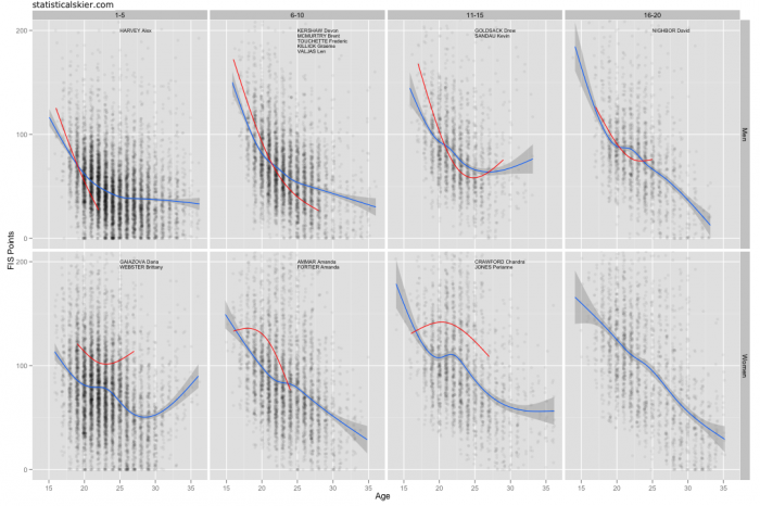
 Each panel displays the FIS points vs. age for athletes who’s best result at WJCs or U23s was 1-5, 6-10, etc. The blue trend lines represent the average trend across all skiers in each panel. The red trend lines are the average of just the Canadian athletes in each panel. The names of the Canadians in each panel are shown.
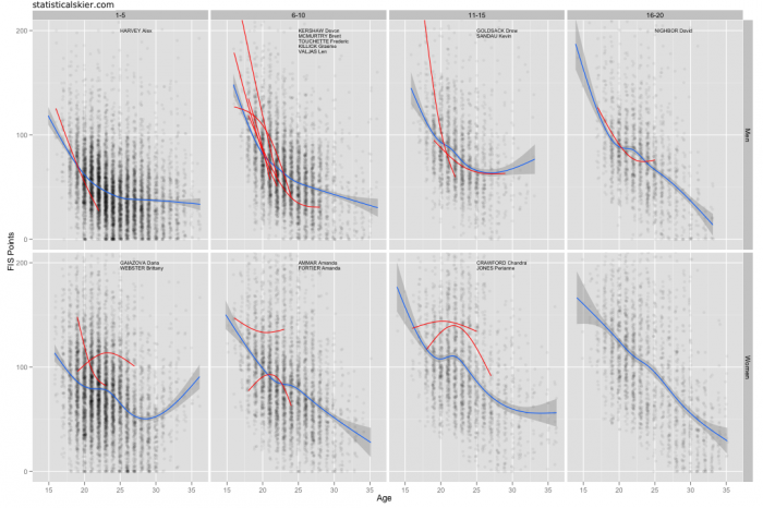
I thought I’d expand on these graphs a little and give you an alternate version with a trend line for each Canadian individually:
 I apologize for not labeling the red trend lines with names more precisely, so that you can tell which line goes with which name. In the men’s 6-10 panel, it wasn’t really possible, and in most other cases which name goes with which line should be fairly obvious if you’re familiar with the athletes and the ages at which they’ve competed.
Note the large differences between these two graphs in the women’s 6-10 panels.
Related posts:

