I apologize again for the heavy cycling bent I’ve been on lately. You just can’t pass up the chance to make fun graphs like these, though.
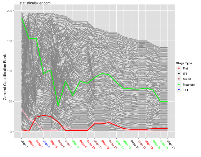
This is just your standard bumps chart for GC rank from the 2010 Giro d’Italia. Somewhat confusingly (to casual bike fans like me) the colors of the jerseys are different than in the Tour de France. So the overall race leader here wears pink, the sprint points leader wears red (although this has apparently changed several times through the years) and the mountain (or climbing) points leader wears green.
The classification of each stage into mountain, mixed, etc. I simply took from here. The graph is below the fold:
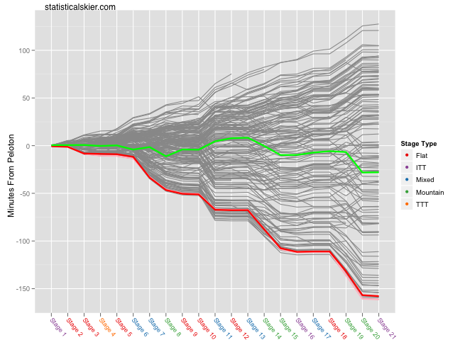
Those colors aren’t the best. Shouldn’t have tried to pick them by hand. And the same plot but using the time from the peloton (defined as the median rider after each stage) and a better color scheme:
It’s hard to notice the pink line on this one since they lie nearly on top of each other.
Related posts:
- <Tour de France Bump Charts (Updated)
- <Tour de France Bump Plot: Stage 12
- <Stand Back! This Graph Is Alive!


