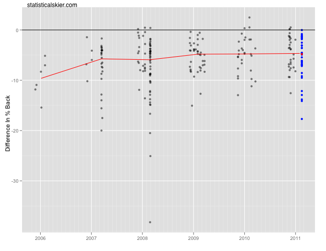
As before, with the U23 racers we typically have more data to work with, since these folks have generally been around longer and so are likely to have raced against each other more often. We’ll continue using the percent back difference plots, that examine how a particular skier has fared against each of their competitors in the past. So let’s get a sense for what some of the North American performances mean, starting with Alex Harvey:
Harvey was certainly a favorite to win coming into this race, given his strong results on the World Cup this season, and he didn’t disappoint. Today’s race is in blue, with the median from today’s race in red and a red trend line to give you a sense of how his performance against these particular skiers has changed (or stayed the same) over time. What this graph suggests is that his victory today wasn’t an unusually good or bad performance for him; it also suggests that the folks today that he’s raced against before he’s almost always beaten.
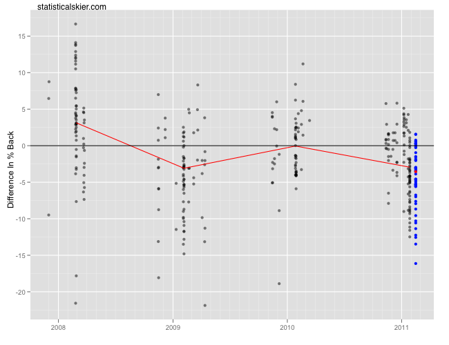
Moving on to Noah Hoffman:
This looks like Hoffman had a somewhat off day, but not dramatically so.
Lastly, I’ve got to include one look at Andrew Musgrave, since the guy kind of fascinates me:
Like his previous U23 race, this looks fairly average, to slightly above average for him this season.
Related posts:
- <Davos Recap: Distance – North Americans
- <Recap: Davos Sprint Con’t
- <La Clusaz Recap: North American Men


