With the biathlon World Cups taking a turn through my childhood backyard these past few weekends, I’ve been spending more time trying to come up with some nice biathlon plots.
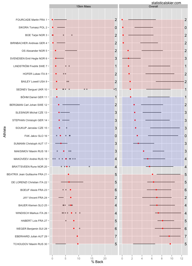
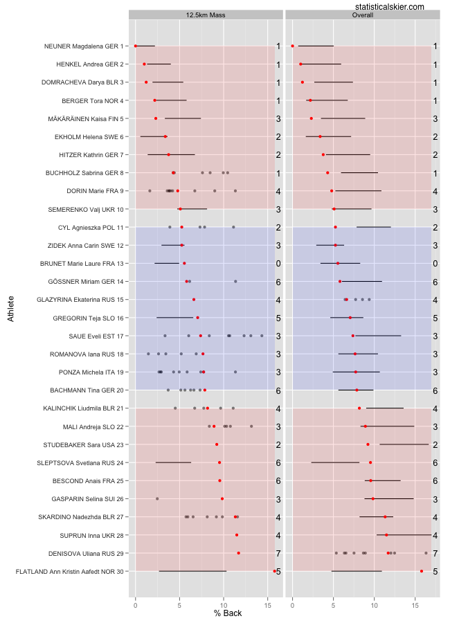
Fairly early on with my race snapshot graphs I switched over with the cross country ones to show each athlete’s results compared to all their races and also compared to just those from a particular technique. Obviously that doesn’t really apply to biathlon, since they only skate. But just as in cross country, the different events (Sprint, Pursuit, Mass Start and Individual) can lead to systematically different percent back values. Mostly this is an issue in the pursuits and mass starts. So yesterday I actually only used mass start races for those graphs. But I really should make a two-column version for biathlon as well, so here they are:

 The graphs still work the same way. I’m plotting percent back from this particular race (red) and the middle 50% of each athlete’s results over the past several years (black bar) or just the raw results if there aren’t very many (points). The text on the right is just the number of misses from this particular race. Obviously, in the left column looking at only the mass start races there’s a bit less data. But you can also see how the comparison changes, since mass starts tend to lead to lower percent back values.
I’ll have some other new biathlon graphs later today that I’l particularly proud of for looking at individual skiers…
Related posts:

