My good friend, and general cycling expert, Cosmo recently tweeted about what he perceived as more GC (overall ranking) shakeups taking place in Tour de France stages with a downhill finish as opposed to uphill, mountaintop, finishes. He then followed that up with a comment to that effect, linking back to my bumps chart as evidence. Those charts do shed some light on this question, but if you read my first response I hedged a lot, since trying to visually assess which stages have the most jumbled, tangled lines in the bumps chart isn’t an exact science.
Of course, nothing I do here is really an exact science, but at the very least I owe Cosmo a better look at the data. I’ll leave it to him (and others) to say what it means vis-a-vis mountaintop versus downhill finishes.
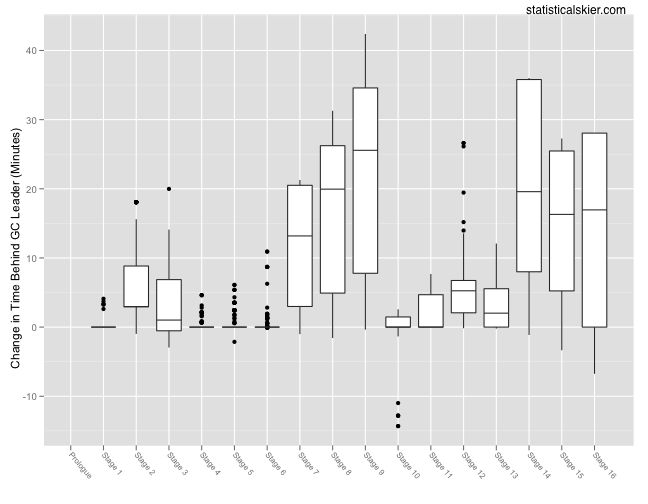
There are two ways we could measure changes in the GC rankings: by time or place. First let’s look at changes in time behind the leader:
 If I’d sat and thought about this for a second, rather than just diving in and making the plot, I could have predicted this. Across all riders, the overwhelming trend is to lose time relative to the race leader which is why nearly every value here is positive.
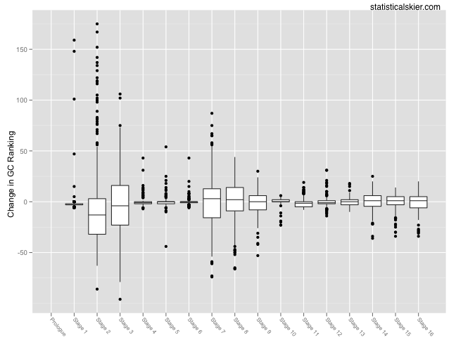
So maybe changes in GC rank will be a little more illuminating:
 Ok, so this shows quite a bit more motion in both directions, which is more what we’d expect. (The numbers correspond to the actual numerical change in position so positive values mean you moved down in the GC standings and negative values mean you moved up.) In terms of GC rank, the biggest shifts happened on Stage 2, followed by Stage 3 and Stage 7, which shook things up about the same amount. After Stage 7, we saw smaller shake-ups in Stages 8 and 9. Since then, things have been more stable.
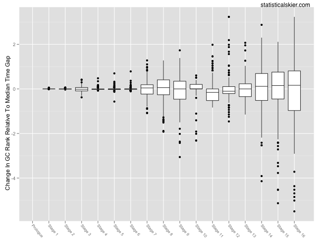
However, this is really more complex and subtle than you might think. As my first graph made clear, as the Tour progresses the time gaps between riders just get bigger and bigger. This means that it will necessarily get harder to achieve large changes in GC rank later in the Tour. If we want to look at where the big GC shake-ups happen, we should account for how big the time gaps are at the start of that stage by scaling the data:
 Since I’ve scaled the changes in rank, the actual values on the y-axis have only relative meaning now. All I did was to scale each GC rank change by a factor proportional to the median time gap at the start of each stage (i.e. at the end of the previous stage). Things look radically different here, but all is still not well. The problem is that the overall increase in the median time gap as the Tour progresses is swamping the rest of the data. Notice how now the range of the boxplots simply get bigger as we move through the Tour.
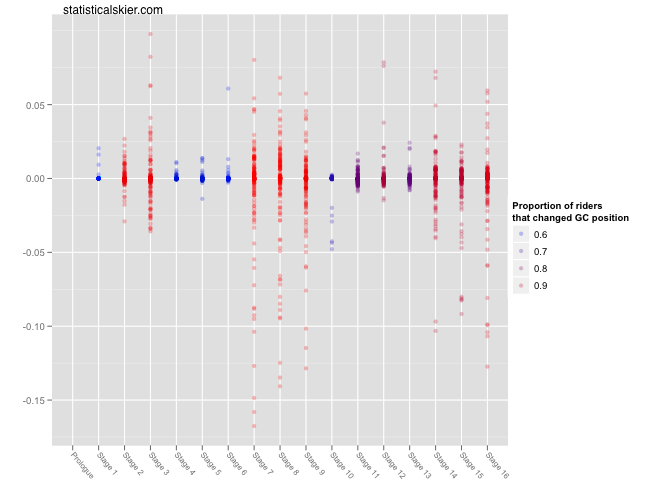
Whereas before we might have suspected that Stages 2 and 3 were getting too much attention and Stages 14-16 too little, now it appears that we’ve swung too far in the other direction. Our mistake was scaling the changes in GC rank by the same value, the median, for each rider. Instead, each individual change in GC rank needs to be adjusted by the appropriate amount. What is the appropriate amount, you ask? Well, I settled on doing the following: suppose a rider moves from 5th to 12th in the GC standings between Stages 10 and 11. We look back at the time gap between 5th and 12th after Stage 10 and that’s our adjustment factor (actually something proportional to that number, just to keep the values from ballooning into the thousands). If that gap was really small, then moving from 5th to 12th gets less weight and if that gap was really large it gets more weight. The results are in the following graph:
 I stopped with the boxplots so that I could add another bit of information here using some color. The y-axis represents the magnitude of each GC rank change, weighted by the relevant time gap for that rider. I added some alpha blending to give you a sense of where the dots are denser. Since a lot of these dots are exactly on zero (no GC change) I added the colors to give a sense of that gradient as well.
This seems more sensible to me. The big shakeups in Stages 2 and 3 have been downgraded a bit since the time gaps at that point in the Tour were so small. The biggest changes (so far) really seem to have been Stages 7-9. Additionally, the movements taking place in Stages 14-16 are getting the respect they deserve now, after correcting for the time gaps the riders have to overcome later in the race.
Phew.
That was way more complicated than it needed to be. But hopefully enjoyable.
Related posts:
- <Tour de France Bump Charts (Updated)
- <Tour de France Bump Plot: Stage 12
- <Tour de France Bumps Chart: Stage 14

