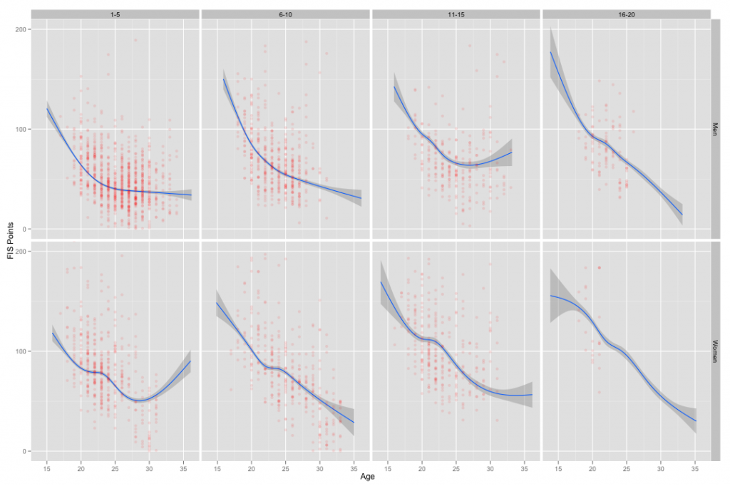
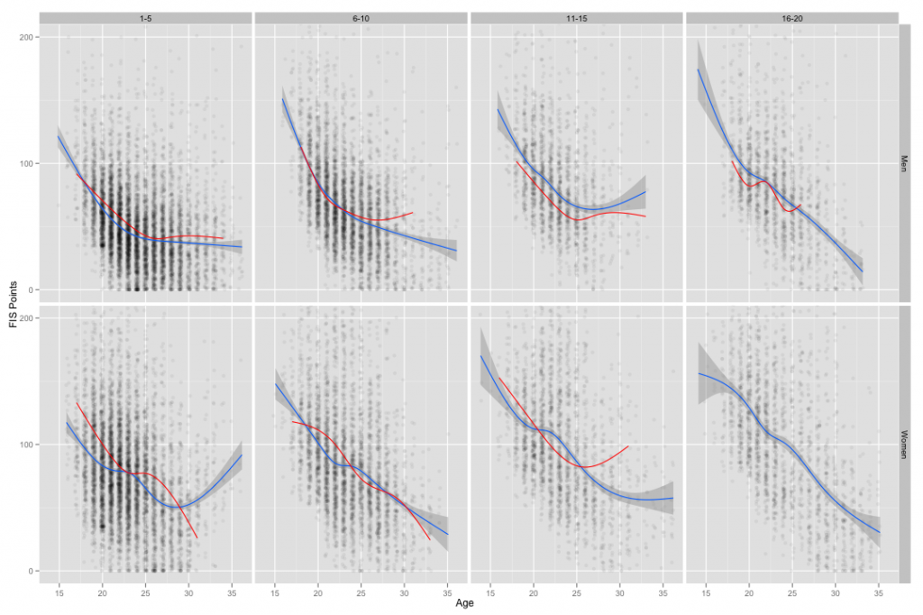
Yet another in a continuing series. This time, Italy. First up is the original form of the graph where each panel contains athletes grouped by their best performance at WJCs or U23s (1-5, 6-10, etc.):
As before, the blue lines are trends for the entire population in each panel, the red lines are the trends only for the Italian skiers in each panel. The women’s 16-20 panel is omitted, as there is only one skier there with only ~3 seasons of results.
As we’ve seen before, the general trends lines can mask a lot of variation:
 This time I’ve only plotted the points for the Italian skiers (red) but the blue trend lines remain the same. Fast skiers (1-5 panels) ski slowly sometimes. But this is still lumping multiple athletes together, so let’s look at the paths for each individual skier:
This really drives home the level of variation between individual skiers, I hope.
Related posts:
- <How Well Prepared Are World Cup Rookies? (Part 1b: Distance)
- <Post-WJC/U23 Development: Canada
- <Post-WJC/U23 Development: Germany


