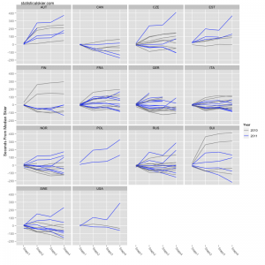
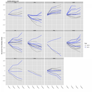
An excellent suggestion from the comments was to redo the graphs by nation, but overlay them on top of the same data from last year’s Tour for comparison.
Easily done! I’ve pruned back the nations plotted even further to focus more heavily on the big guns, and it also enhances readability. Also, keep in mind that the races from the equivalent stages from last year’s Tour were not all the same format as this year, I believe (Stage 4 was the second sprint last year). As before, click through for full versions:
Related posts:


