As with most stage races these days, the Tour de Ski included some handicap start pursuits. Generally, the athletes will start in a staggered fashion based upon their time back in the overall standings, and the first person to the finish line wins the stage.
This creates some very unusual incentives for the athletes, depending on where they are in the overall standings. Many of the athletes are no longer really racing against each other, only those skiers who happen to be near them in the overall standings. For example, there’s no really sense in which Therese Johaug was racing against Liz Stephen in Thursday’s pursuit. Johaug only really cared about maintaining the gap behind her and trying to catch the leaders.
This means that isolating the times for just that stage is an almost useless way to gauge performance. Johaug, for instance, skied that stage around 15 seconds slower than Stephen, but we probably don’t think that that means much about Stephens’ ability compared to Johaug’s.
So I wonder about these things when I read stuff like this, or this, talking about how well Stephen and Freeman skied in the pursuit based on their times for just that stage. By my calculations, Freeman had the 11th fastest time of the day and Stephen the 13th. But that alone doesn’t mean much to me, since many other skiers were really only racing against the skiers near them, rather than the whole field.
If an athlete says they had a good day, of course, I’m inclined to believe them. They alone know how their body felt and whether it was a good effort. But, you know, I like to measure stuff, so let’s try.
Let’s compare Freeman and Stephen only to those skiers who started near them in the pursuit. Specifically, how did Freeman and Stephen’s times for the day compare to their historical performances against these skiers? Better than average? Worse? About the same?
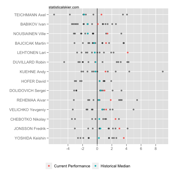
Here’s the relevant graph for Freeman:
 Ah, I see now I forgot to label the x axis. It’s the difference in percent back between Freeman and each skier for a specific race. Negative values mean Freeman lost and vice versa. The Current Performance refers to Thursday’s pursuit. The blue dots are the medians of the historical match ups (gray). What have we got here?
The red dots are basically all solidly to the right of the blue dots, confirming that Freeman did in fact do better against these specific skiers than he usually does. That suggests to me a good, but not spectacular race. Note that the red dots are generally still within the typical variability of the match ups against each skier.
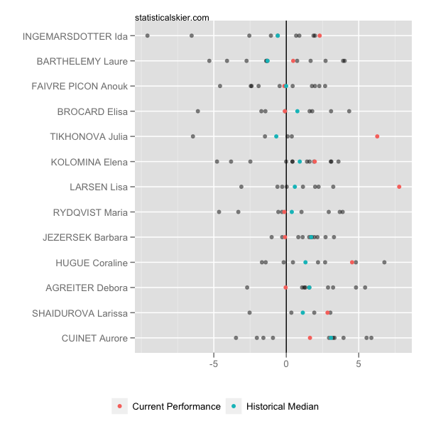
How about Liz Stephen?
 This seems more mixed to me. Stephen said she had a good race, and I’m not disputing that. But there is a difference between skiing well and a good result. So this suggests to me that while she may have skied well, I don’t think her result is quite as good as it may have seemed at first glance.
She fared far better against Tikhanova and Larsen than she typically does. But the rest of the comparisons are either fairly close, or actually going the other way, with Stephen faring slightly worse against these skiers than she typically does.
I’ll reiterate that I don’t think this means Stephen had a bad race. Like I said, an athlete typically knows when they pushed themselves as far as they could that day. But in this case, I don’t think it necessarily signaled a result that was as good as it may have seemed from just looking at the times for the day.
Related posts:
- <Kuusamo WC Recap: North Americans
- <La Clusaz Recap: Distance Mass Start
- <Race Snapshot: TdS Prologue

