A few notes about this data. The website that I scrape these results from isn’t, shall we say, the most consistent when it comes to the spelling of athlete names, or even their teams. That can make it difficult to slice the data along those dimensions, since it requires a fair bit of work adjusting and fixing things by hand.
I think I tracked down all the abnormalities, but you never know…
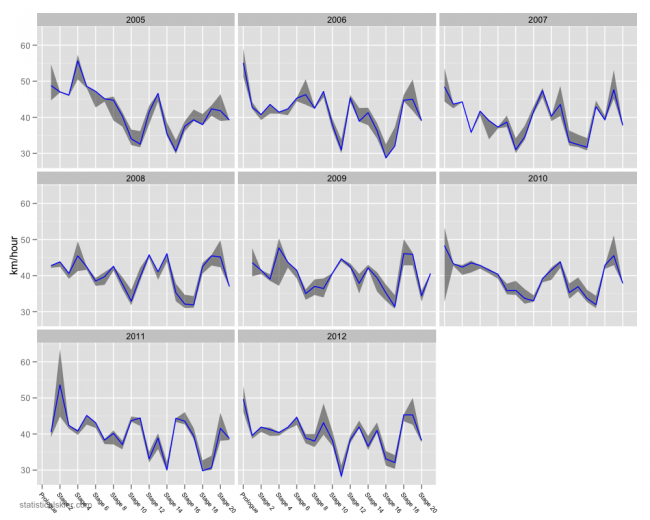
In any case, here’s a look at the average speed for each stage for recent Tours. The blue line is the average speed of the median rider, and the shaded region represents the (approximate) range of average speeds for the entire peloton.
I’m still suspicious of how large the range of speeds is for a handful of stages. In particular the prologue in 2010 and Stage 2 in 2011, but I’d have to spend a lot more time pouring over the data to be sure.
Related posts:
- <Tour de France Bump Plot: Stage 12
- <Tour de France Bumps Chart: Stage 14
- <Tour de France Charts: Stage 17


