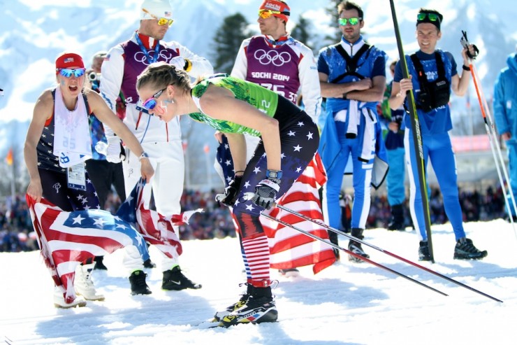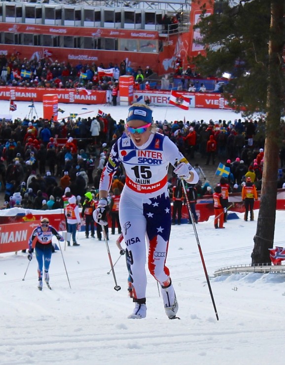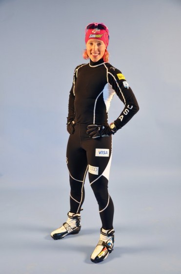
A national team uniform for cross-country skiing has to do a lot of things. At the most utilitarian level, it has to wick sweat and aid performance while an athlete pursues one of the world’s most demanding sports at temperatures between –4 F and 40, in steady snow or driving rain or anything in between. At the functional level, it has to let spectators and coaches identify where their athlete is out on the course, while distinguishing them from athletes from other countries. And at the symbolic level, it lets the athlete know that he or she is competing on behalf of their country, for everything that that means. Ask a skier who has represented the United States in international competition what it meant to them to pull on a national uniform for the first time. They’ll probably be able to tell you.
(And if they ever forget, this detailing from Craft and L.L. Bean on the American uniforms, ca. 2015/2016, is there to remind them. “You are representing the United States of America,” a slogan intones, above a martial-looking eagle, with a U.S. Ski Team master mark for its aegis, gripping an olive branch (?) in its dexter claw and a skis and ski poles fasces in its sinister. “Pretty fun to be representing an American brand with our American uniforms!,” wrote Sadie Bjornsen in a blog post describing the uniforming process.)
For whatever reason, the period roughly one decade ago represented the highwater mark for domestic and global coverage of ski uniforms on this website. There was “US Ski Team Brings Suit Consistency,” from Jan. 2009 (lede: “After years of a remarkable level of wardrobe schizophrenia, the US Ski Team has ushered in a new era of racing suit consistency that should make it easier to follow our favorite US athletes on the race course.”); “The costume disciplinarian speaks: Is it better to look good than to ski fast?” from July 2009; “The Best and Worst (Suits) of the Olympics,” from Feb. 2010; and “USST Goes Black for 2010-2011,” from Oct. 2010 (lede: “In the sport of cross-country skiing, most people would agree that competing with New Zealand is probably smarter than picking a fight with Norway.”).
After that, attention to this important issue appears to have lain largely fallow until the 2018 Winter Olympics in Pyeongchang, which brought “FasterSkier’s Unofficial Guide to 2018 Olympic Cross-Country and Biathlon Suits.”
So it seems to have been nearly 10 years since the last sustained attention to the uniforms of the Davis U.S. Cross Country National Team Program (née U.S. Ski Team). To fill that gap, FasterSkier hereby presents A Visual History of the United States Ski Team National Team Uniform, 2008–2019.
(Why 2008 for the starting point? Mostly for the simple logistical reason that the image library in the current FasterSkier content management system, WordPress, only goes back to 2008, so this article can be written while using only images that FasterSkier may legitimately post on this site. To go back to closer to the start of this century would require a lot of external links to Getty Images and not that many photos to actually look at on this website. That said, this piece from 2009 has a nice visual roundup of the plethora of different USST designs worn from 2006–2008, which takes you back two more years. Before that, well, just imagine Kikkan Randall and a lot of other skiers you probably haven’t thought about for a while — Wendy Wagner, anyone? Rebecca Dussault? Sarah Konrad? — wearing various iterations of early-aughts red and black.)
2008/2009 World Cup season: Red
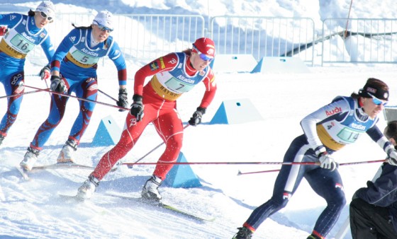
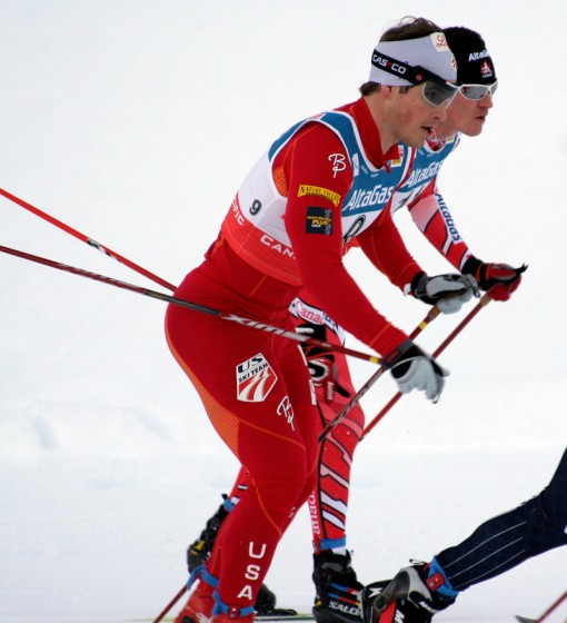
As a contemporary uniform article explained, “There are currently two suit variations being used by US Ski Team athletes, and athletes racing for the US in international events. They are so similar, that for practical purposes (identifying US skiers in a race) they may as well be the same. Both suits are predominantly red, with one version having patches of orange, and the other silver.” Both were manufactured by Norwegian company Bjørn Dæhlie.
There appears to have been no change to the basic World Cup design for the 2009 World Championships in Liberec, Czech Republic:
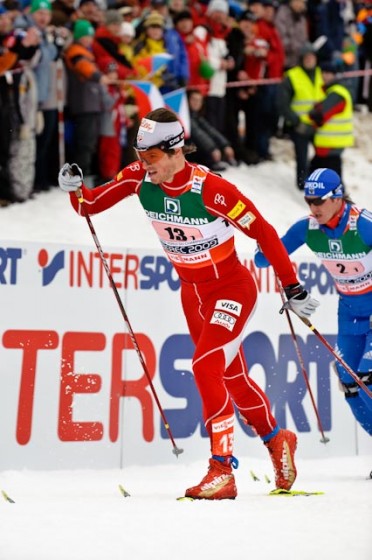
2009/2010: Still red Bjørn Dæhlie
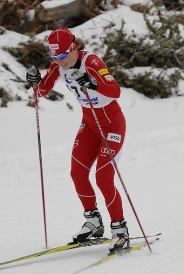
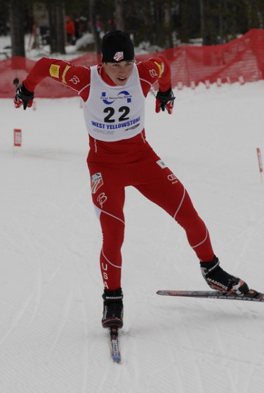
Honorable mention, domestic suits division:
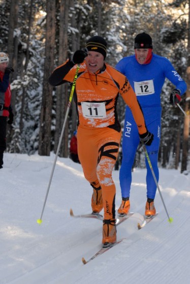
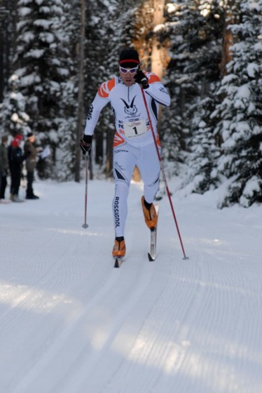
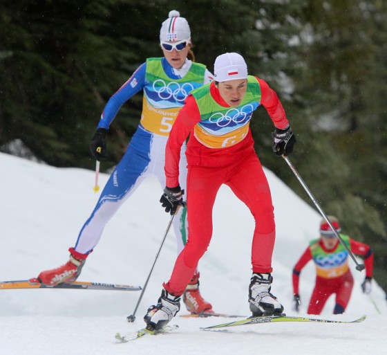
2010 Winter Olympics, Vancouver: Red and silver
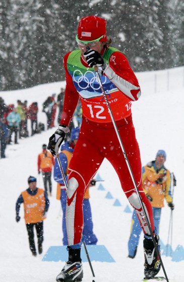
For the Olympics, the Americans appear to have taken their World Cup template – Bjørn Dæhlie suit, largely red – but have changed it by, inter alia, lightening the shade of red, adding “USA” on the right arm and left leg, adding silver accents, and of course removing all sponsor logos. Kikkan, already skiing in her third Olympics, coordinated with a red headband, red gloves, and her famous pink highlights. Andy Newell went with the red hat (he may not have had a choice), but was otherwise somewhat less vermilion.
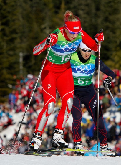
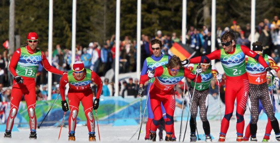
There was a lot of red in Vancouver. For example, here’s Andy Newell (far left, bib no. 13-2) tagging Korin Koos for the U.S. in the team sprint, while Petter Northug (far right, bib no. 2-2) tags Øystein Pettersen (middle right, bib no. 2-1) for Norway. (An entire standalone article could likely be written on the Canadians’ infamous kit (bib no. 4, back right).)
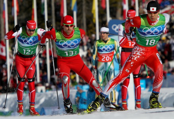
Or here’s Newell in the middle, between Switzerland’s Dario Cologna (bib no. 12) and Yuichi Onda of Japan (bib no. 18):
Finally, Poland (shown here: Sylwia Jaśkowiec, bib no. 6) was just red:
2010/2011: The black era begins
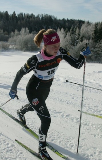
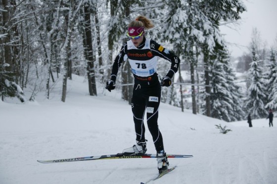
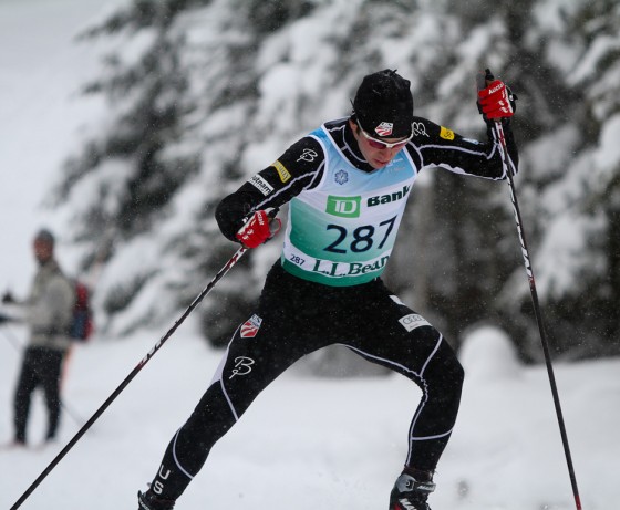
Perhaps as a natural reaction to the dominance of a single color across multiple nations, the U.S. made a significant shift for the 2010/2011 World Cup season: black. The color does not appear on the national flag or in other common American iconography, but it is certainly distinctive. Bjørn Dæhlie remained the suit manufacturer.
Or, as then-FasterSkier reporter Nat Herz wrote in fall 2010, “After any number of years of being drowned out by a sea of Norwegian crimson, U.S. Ski and Snowboard Association Nordic Director John Farra said that the USST will be ‘distinctly not red’ for the 2010-2011 season—including at World Championships in Oslo. ‘We went in a very different direction, in part from our experience in Oslo, where they [Norway] have a nation’s group of ten, and we can barely see our athletes in the group,’ he said.”
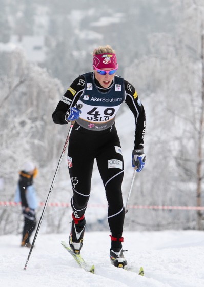
2011/2012: Still black Bjørn Dæhlie
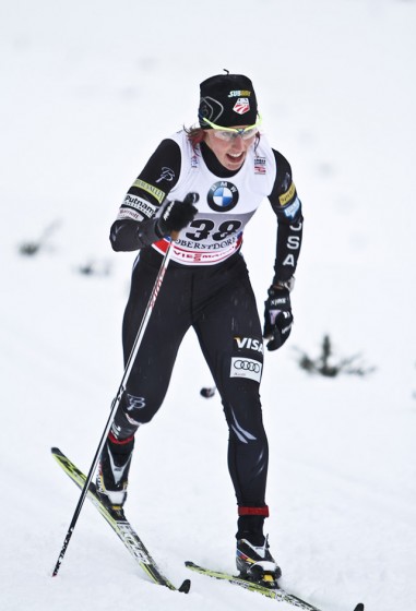
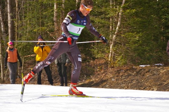
2012/2013: Still black
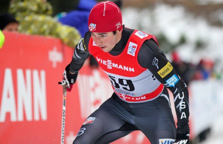
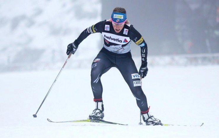

2013/2014: Yup, still black


2014 Winter Olympics, Sochi: Stars and stripes
The 2014 Winter Olympics, in Sochi, Russia, were known at the time for Kikkan Randall’s disappointing result in the individual skate sprint, and after the fact for the revelation that Russia was engaged in a massive state-sponsored doping scheme and cover-up. They were also significant for a change in uniforms: stars and stripes on the right arm and left leg, and a large “USA” on the right leg. The left arm was relatively plain. Also, several of the U.S. women drew attention for racing sleeveless in warm temperatures. Bjørn Dæhlie continued to be the brand logo featured on the upper right quad. (Pictured below: Noah Hoffman, in a solo race, and Sadie Bjornsen, in the women’s relay.)
2014/2015: Stars and stripes redux
Athletes took to the trails next season with a slightly modified version of the recent Olympics uniform: Larger stars on the left upper quad, with a deeper blue background. The stripes on the left leg became more pronounced and stretched farther up the race suit, to above the knee. Also, once the non-commercial period of the Olympics had passed, there was space for sponsor patches on the arms and legs.
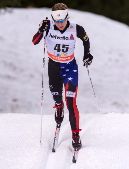
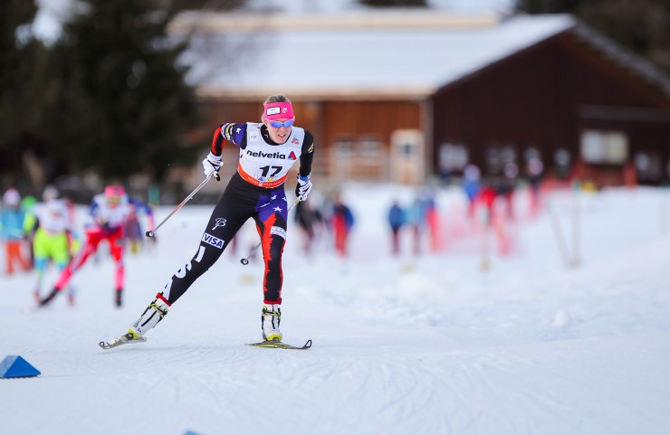
World Championships, in Falun, Sweden, brought a mostly-white version of the uniform, helpful for the warm temperatures and soupy conditions that characterized many of the races. Here’s Sadie Bjornsen in Falun in February 2015:
2015/2016: Red, white, and blue
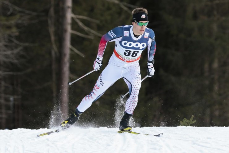
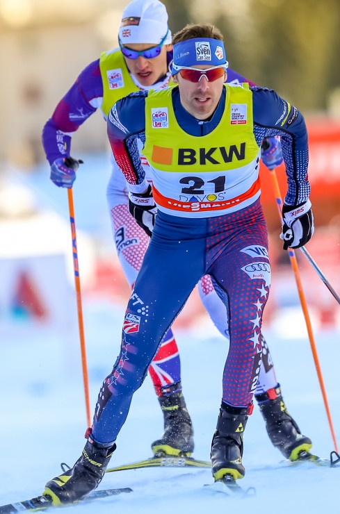
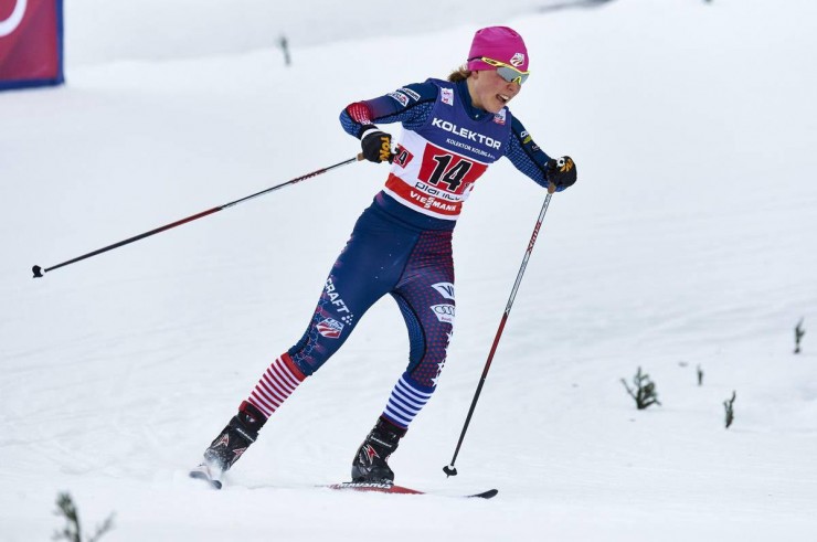
By fall 2015, the move away from black, and towards red, white, and blue, was complete. Athletes now had the option of being attired in a predominantly white color scheme, which would aid in preventing overheating on warm days, while thankfully solving the transparency issues that had plagued recent all-white suits for Sweden or Italy. An alternate version had roughly the same patterning, but with blue as the primary color. Notably, the Americans also moved to a race suit manufactured by the Swedish company Craft for the first time in this survey.
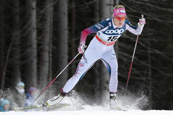
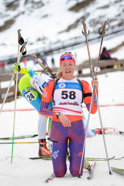
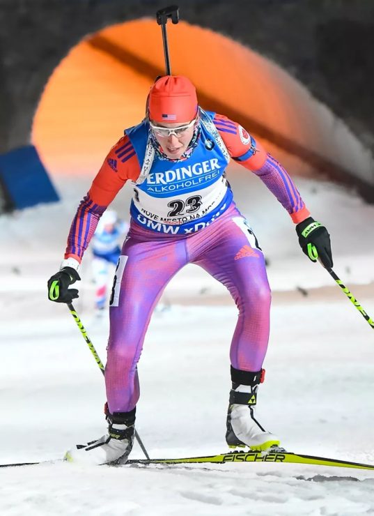
Honorable mention: Trending towards “purple cobras” for American biathlon but not there yet.
2016/2017: More red, white, and blue
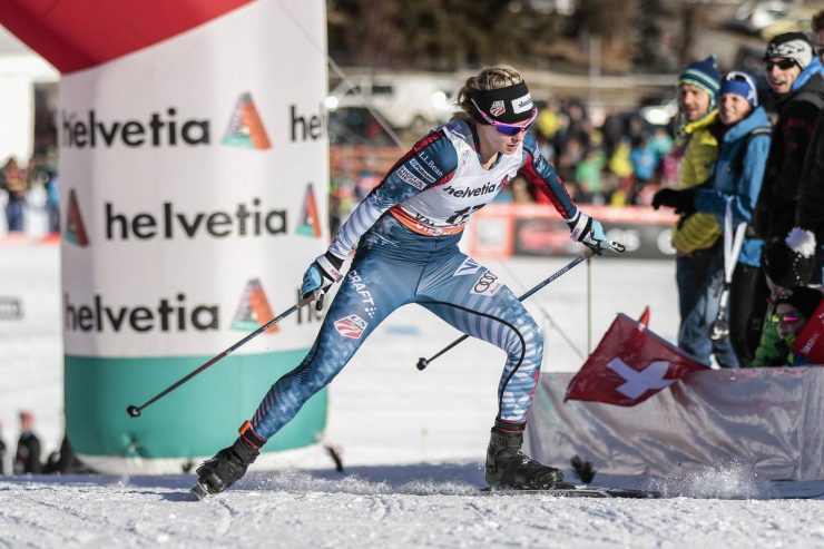
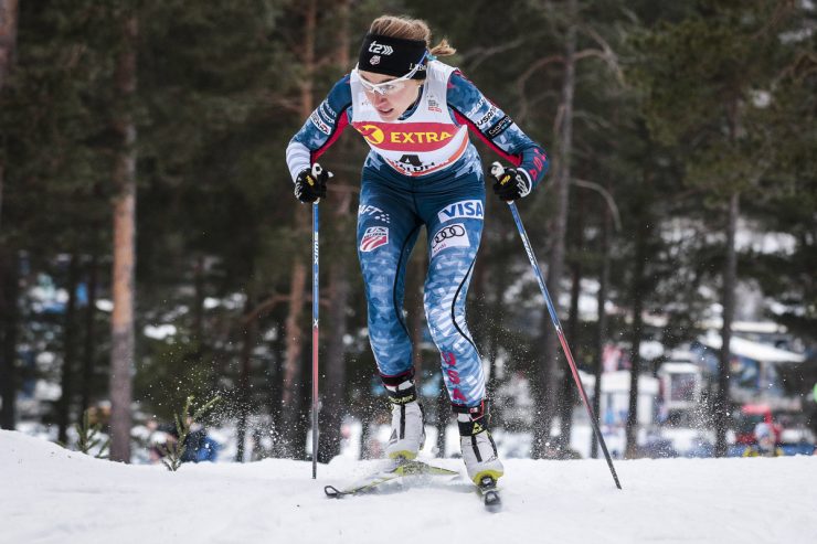
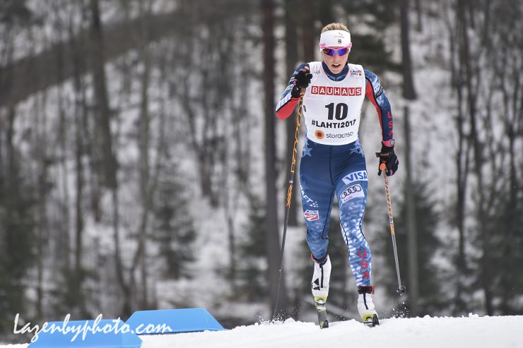
An interpretation of red, white, and blue, still on a Craft suit, remained in place for the 2016/2017 World Cup season, which was marked within the team by Randall and her husband, Jeff Ellis, traveling the European race circuit with a newborn in tow. The changes to the USST uniform were less dramatic than Randall’s familial status: Still red, white, and blue, though now with blue as the dominant color. The entire left leg, and the bottom half of the right leg, had markings, somewhere between subtle striations and full-on stripes, that evoked the stripes of the American flag. (Let’s put aside for the moment the fact that the stripes on the actual flag are white and red, not white and blue.) The pattern was repeated on the lower right arm. An understated evocation of blue or white stars marked both lower legs, with more pronounced stars scattered around the bottom of the torso (possibly the top as well, but nearly all of one’s torso is typically covered by the standard race bib). The left arm and left leg both proclaimed “USA” in red lettering.
The vehicular logo on the legs remained that of Audi, as it had been since the start of this history.
There appears to have been no change for the 2017 World Championships. At least to the uniforms; on the race course, the Americans won an unprecedented three medals.
Meanwhile, biathlon saw the advent of the beloved “purple cobras” era:
2017/2018: Red, white, and blue redux
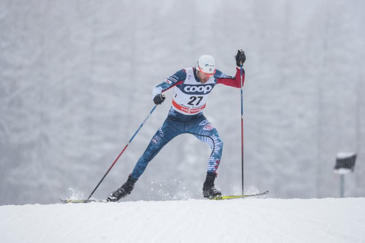
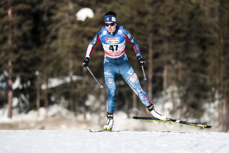
There appears to have been no change for the 2017/2018 World Cup season: still red, white, and blue, but mostly blue, on a Craft suit. The most notable change may have been to the car sponsor… for the first time since at least the scope of this article, a Toyota logo was on the leg, not Audi. Nichts ist unmöglich (“Nothing is impossible”), as the company’s European slogan proclaims.
2018 Winter Olympics, Pyeonchang: Red, white, and blue, and a lot of stripes
There is a somewhat famous picture from the 2018 Winter Olympics that you may already be familiar with. In the picture, Jessie Diggins, on the lefthand side of the frame, stretches her left foot across the finish line to secure an historic Olympic gold medal for the United States. Her left arm mirrors the gesture, punching the air above her in what is presumably an instinctual counterbalance to the lunge but also appears, in a frozen moment in time, to be a triumphant fist-pump. In the middle, her face is rent in a rictus of exertion and triumph. On the righthand side of the frame, Stina Nilsson of Sweden lunges as well, 0.19 seconds behind Diggins. Mute V-boards and still flags fill in the background of the image, as Maiken Caspersen Falla of Norway appears to stand up and stop skiing in order to watch the finish unfold.
It was a few seconds before 7:16 p.m. in Pyeongchang, 4:16 a.m. in Afton, Minnesota, and 1:16 a.m. in Anchorage, Alaska. If you’re reading this website, you may remember where you were at that moment.
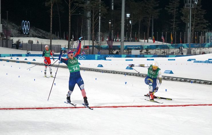
But let’s talk about the uniform. Another Craft product, the dominant impression is once again blue; in the photo above, taken at whatever distance from the finish Noah Hoffman was allowed to stand while there was a race on, there is a whole lot of blue approaching the finish line between the American suit and the Swedish one. Some white stripes are visible around the knee of Diggins’s suit, trending down the lower leg, though they are soon subsumed by The Relay Socks.
On closer inspection, however (see next picture, below), there are a lot of stripes going on in this uniform. The entire legs are striped, with stronger white stripes on the sides of the torso fading to fainter stripes at the top of the leg. The knees have white stripes on a blue background, with the width of the white stripes gradually decreasing and the extent of the blue interstices gradually increasing across the course of the knee. As shown in more detail here, the patterning gives way to thin red stripes against a blue background, on the lower right leg, and a bold white “USA,” on the lower left.
The right arm has white splotches, potentially stellar in nature, against a blue background. The left arm has red and white stripes to midway down the biceps, which then transition to blue and red stripes.
The torso has a subtle blue and black patterning perhaps best described as “Swedish forest camo.”
Finally, although it is not apparent in either picture, “USA” was written in white letters against a blue background on both the right arm and lower left leg, as shown in the images available here (lettering on arm) and here (lettering on leg).
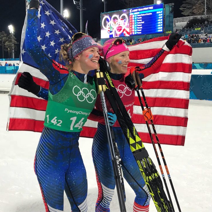
Here is another fine picture of Diggins and Randall from the evening of February 21, 2018. This one does not show the famous American relay socks, but does show the equally renowned facepaint and glitter. As Diggins has written, in what is both a pro-glitter cri de cœur and “a brief message for [the] high school officials” who harshed on her glitter as a junior racer, “Putting on glitter before my race is a salute to the little girl who just wants to ‘go super speed!!!’ It’s a promise to myself that I will race my absolute hardest that day. It’s a ritual that gets me in the right mindset to get out of the start gate and give it everything I have. It’s harmless, doesn’t negatively impact anyone, but to me it’s a huge part of my race morning. . . . And on relay days? Oh man. I get so excited about relay days. I get to paint the flag, ‘USA’ and stars on the faces of my teammates, and one of them will paint it on me as well. Then I put glitter over everything! It’s a special time when everyone is nervous, and excited, to be representing our country and we get together early in the morning to help each other get ready and deal with our pre-race nerves. It’s a little bit like our special striped relay socks…it’s part of what we do, as a team.”
End of the 2017/2018 season: Farewell tour
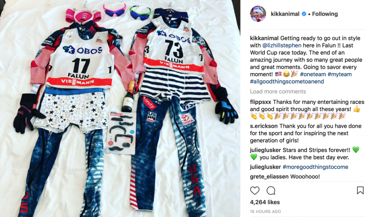
Honorable mention for the 2017/2018 season, World Cup edition: Randall and Liz Stephen’s outfits for their final World Cup race (standard Craft base, but with a whole lot of flair):
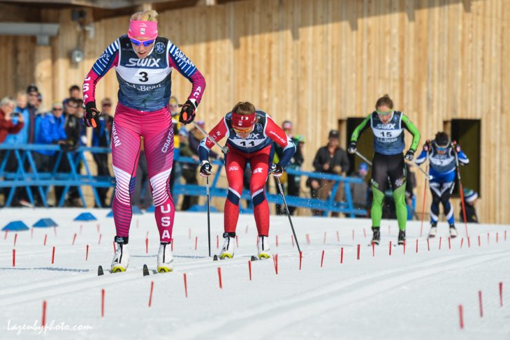
Honorable mention, domestic edition: Randall’s bespoke pink and blue Craft USST/APU suit (essentially the Olympics suit but with different patterning) that she wore for her final race as a professional skier, at Spring Series in Craftsbury. The suit said “USA” on the right arm and left leg, “APU” (for Alaska Pacific University, her club team of 19 years) on the left arm, and “Kikkan” on the left arm and right upper leg.
Honorable mention, face paint edition: This remarkable evocation of Randall and Stephen on Diggins’s left cheek at Spring Series.

2018/2019: Red, white, and blue, but with larger color blocks. Also, a move to Swix.
Randall retired. Stephen retired. Randall got breast cancer. Randall was treated for breast cancer. Diggins worked hard to — successfully — bring a World Cup ski race to Minneapolis. And the Americans kept racing in red, white, and blue, albeit now with a move from Craft to Swix for the suit manufacturer. This year’s interpretation of the theme brought a shift to white as the dominant color, with blue through the torso and upper legs, as well as on the arms. Red was the least-pronounced color this year, limited to accents alongside the larger blocks of blue.
While the Americans continued their perhaps now-accustomed success at the World Cup level, American juniors served notice at World Juniors that they were a force to be reckoned with, taking a gold in the men’s relay, a fourth in the women’s relay, two fourths in classic distance races, and multiple other top-tens. Here are two shots from a frigid Lahti:
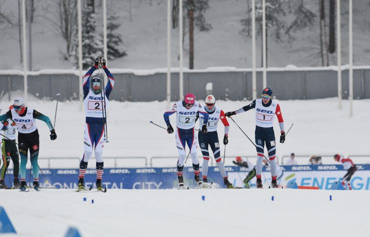
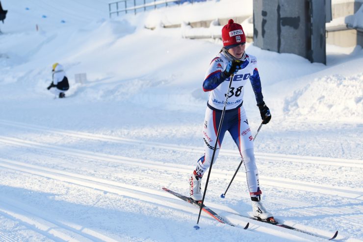
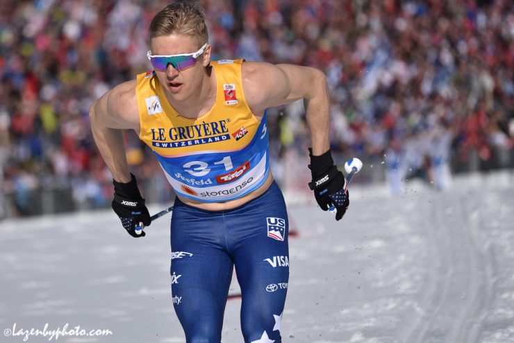
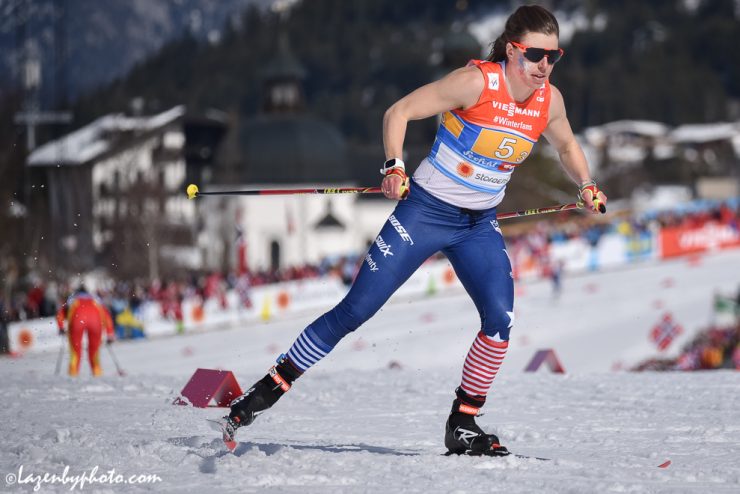
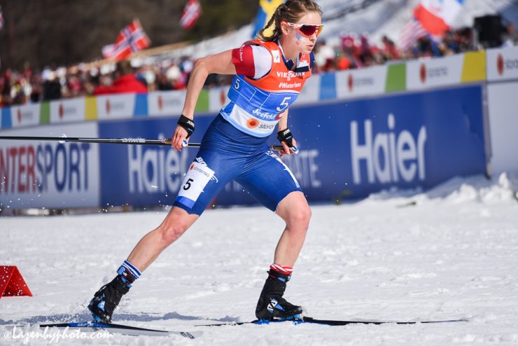
Back to the World Cup (where senior athletes wore the same uniform shown above on the juniors for the regular season), 2019 World Championships, in Seefeld, Austria, brought something new. The dominant hue in the race suit was now blue instead of white, and the large color blocks of the 2018/2019 World Cup regular season were gone. White stars were added to the lower left leg, making the evocation of the American flag far more apparent. Red and white stripes, on the right arm, continued the vexillological theme. While the four sponsor logos on the legs remained the same (Bose, Xfinity, Visa, and Toyota), the Swix logo shifted from the lowest position on the left leg to the middle position on the right.
A Swix press release about the new suits advised: “Featuring bold stars and sharp American colors, the focus was on visibility in mass start events and an iconic look.”
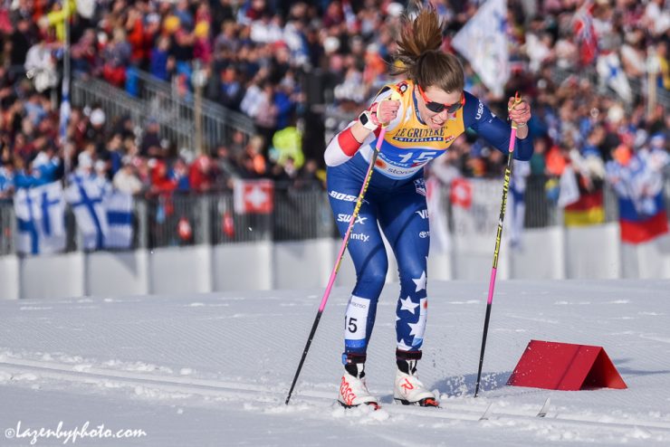
Honorable mention: Bare arms and cutoffs. It was hot in Seefeld. Like, over 50° F hot. Erik Bjornsen raced the 15 k classic with nothing underneath his race bib (sun’s out…), attire typically befitting Eagle Glacier in July more so than Austria in February. Brennan raced the relay with only a t-shirt on top, and no gloves. And Jessie Diggins drew widespread attention for her DIY cutoff look for the relay (which still featured the iconic relay socks, albeit rolled down so they wouldn’t counteract the shorts by covering most of her lower leg).
As Diggins later wrote on her blog a month after World Champs: “Let me start by saying this; no, I was not cold racing in shorts and short sleeves, yes, you should try it sometime, and yes, it was refreshing to have the cold slush hitting my legs! Somehow, the sight of me racing in a short suit was more interesting and befuddling to most reporters than the actual race itself. Clearly, they haven’t ever experienced a Minnesota cold snap. Now THAT is cold weather! … Honestly, it’s hard to describe the amount of distress overheating puts me in, but let me put it this way; racing is already one of the most painful things you can do. If I have to deal with being incredibly uncomfortable, dizzy, and feeling my body start to shut down because I’m way too hot, it becomes even harder to continue pushing my body to the limit, because it’s already that much closer to the limit! And besides, everyone needed the laughs by the time we got to the end of the races.”
2019/2020: Candy cane stripes!
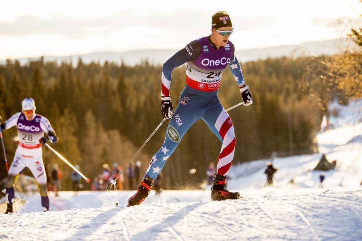
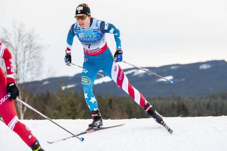
Finally, the start of this season brought the dawn of what has variously been called the “candy cane stripes” or “barber pole stripes” suit (#wellactually a barber’s pole historically has alternating red and blue stripes, not just red stripes as on the current U.S. suit). The left leg features red and white stripes, in a color-appropriate rendition of the American flag. The right leg has white stars on a blue background, again in patterning true to the actual flag. The stars are repeated on the left arm, and the stripes are briefly evoked on the right.
The car sponsor has once again changed, this time to Land Rover.
Here’s Kelley Roche, Soft Goods Product Manager for Swix Sport US, explaining the backstory for this year’s suit design in an email to FasterSkier: “Swix worked with Garen Riedel who owns his own design firm, Riedel Creative in New York. Garen worked closely with the athletes to design a suit that graphically works and they were excited to compete in. The goal is to design a suit that you can pick out of the pack and immediately and know it is a US athlete! This is important for the fan but really important for the coaches who support the athlete during the race. We ended up going with an asymmetric design, a continuation of the Seefeld suit design from 2019 and a retro reference to some of the suits of old, leveraging the iconic and patriotic American flag color palette with a slight color fade across the body.”
Roche added that the suit itself is made out of mesh, which in addition to being flexible and breathable “acts like dimples on a golf ball, balancing the lift and drag of the athlete.”
We’d like your thoughts on the suits. Here’s a google form/survey about the U.S. Ski Team’s suits over the past decade or so.
If you have read this far: For one, congratulations. For another, there is a wealth of historical material available in the FasterSkier archives. If you would have any interest in future compilations with a different focus — American biathlon, say, or best and worst of domestic American race suits over the past decade — please comment below, or email the author directly: gavin (at) fasterskier (dot) com. Thanks, and thanks for reading.
Gavin Kentch
Gavin Kentch wrote for FasterSkier from 2016–2022. He has a cat named Marit.


